2023
client
We partnered with SKNMUSE, a Black-owned luxury skin and body care brand that promotes rest and self-care as the ultimate ritual worth investing in.
project brief
We redesigned the platform to offer a seamless browsing and checkout experience, usher in a cohesive brand narrative, and allow customers to engage with the brand's community-oriented experiences.
roles & skills
UX/UI Designer & Researcher
Information architecture
Brand identity & voice refresh
tool stack
Figma
Figjam
deliverables
Hi-fidelity Wireframes
Branding
Copy
collaborators
CEO (Ezinne Iroanya)
CCO (Ambrose Price III)
4 designers
Solution

Background
Mismatched digital presence
While SKNMUSE had a strong visual identity that showcased their offering of premium, high-end products, their e-commerce presence did not adequately reflect that same luxuriousness, nor articulate their unique origins and commitment to uplifting their community.
Findings
Behaviors and beliefs behind choosing skincare
We wanted to learn more about users’ attitudes and behaviors when purchasing skin and body care, so we conducted user interviews. From our interviews, we heard that:
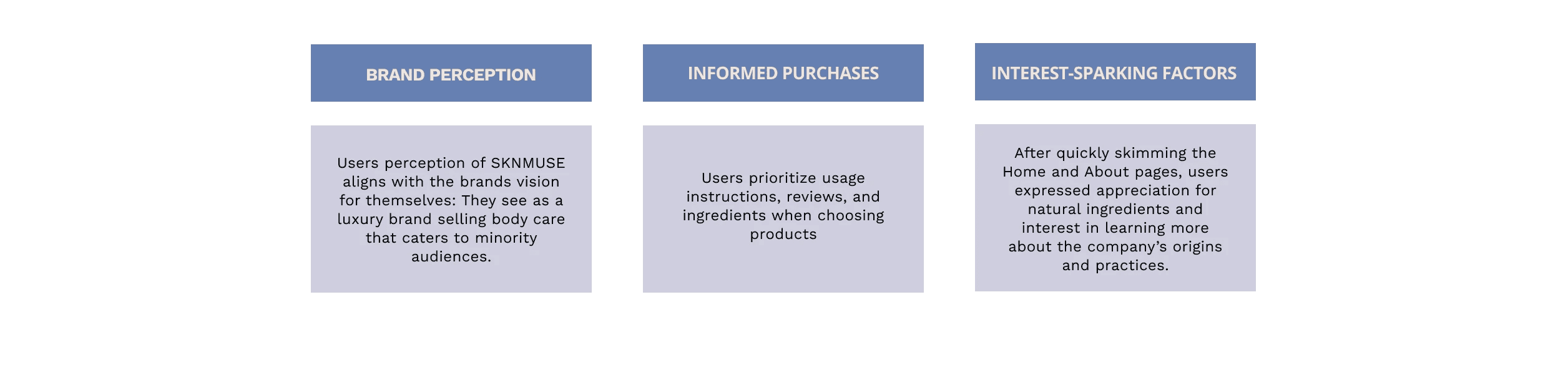
Despite interest in understanding a product's effects, users are overwhelmed by long and confusing ingredient lists
Consumers appreciate authenticity and congruency between a brand's mission and their product offering
Representation and thoughtful aesthetics help personalize products to consumers
Additionally, to get a pulse on users’ reception of the brand's existing website, we sent out a survey inquiring about general perspectives toward skin and body care, user purchasing habits, and first impressions of SKNMUSE's branding and story.
How users interacted with the platform
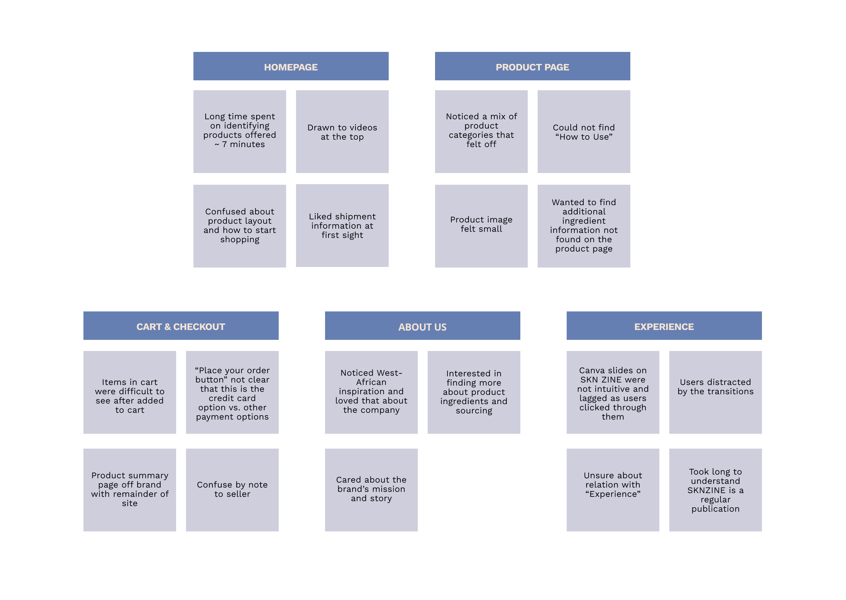
We conducted user tests across our low-fidelity desktop and mobile prototypes. From testing, we learned the following about how users interact with the platform:
Homepage: Users disliked having to scroll to click on individual products and wanted a button to “Shop all” products right away
Checkout: Users couldn’t differentiate between “Express pay” and the typical card payment
Product page: Increase sizing of buttons and other feature selectors


My Approach
Balancing simplicity, dynamism, and brand essence
Finally, we had the chance to speak with the CCO of SKNMUSE to hear more about the company, their mission, goals, and visions for the future website. From our conversation, we learned that:
Products need consolidation and organization
Their target audience was shifting to 35-50 year olds, often seen "Aunties"
Wanted a timeless, classic essence, with a sprinkle of wit and fun
Site should have be mobile optimized, and have interactions and animations
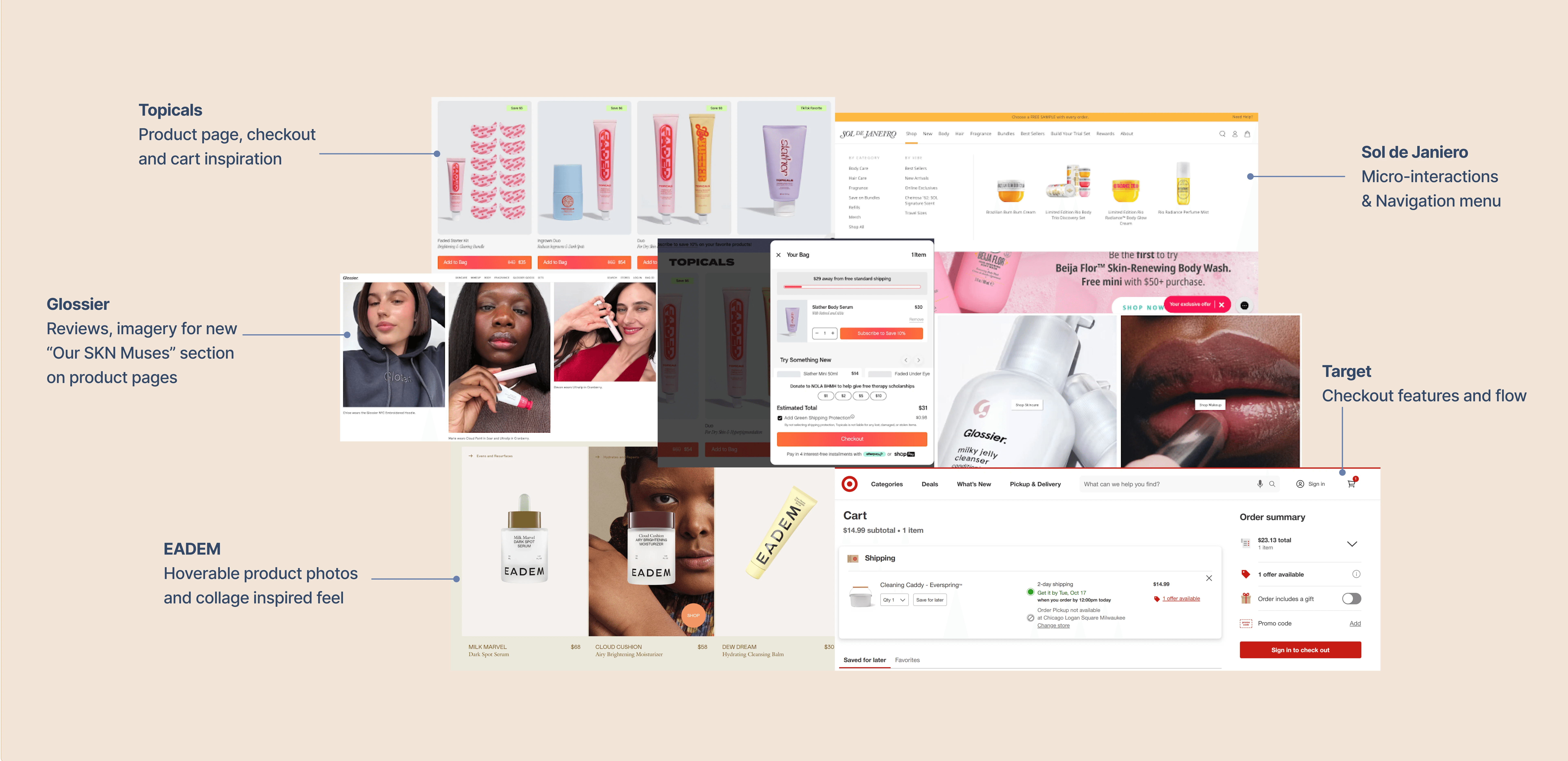
As we began imagining what our website would look like, we conducted a competitor analysis to take stock of general design trends within the e-commerce beauty space.
From both direct and indirect competitors, we drew inspiration from the following brands. Overall, we wanted our redesign to incorporate moments of engagement through micro-interactions, so that we could cultivate the high-end feel SKNMUSE lacked without deterring users from completing purchases.
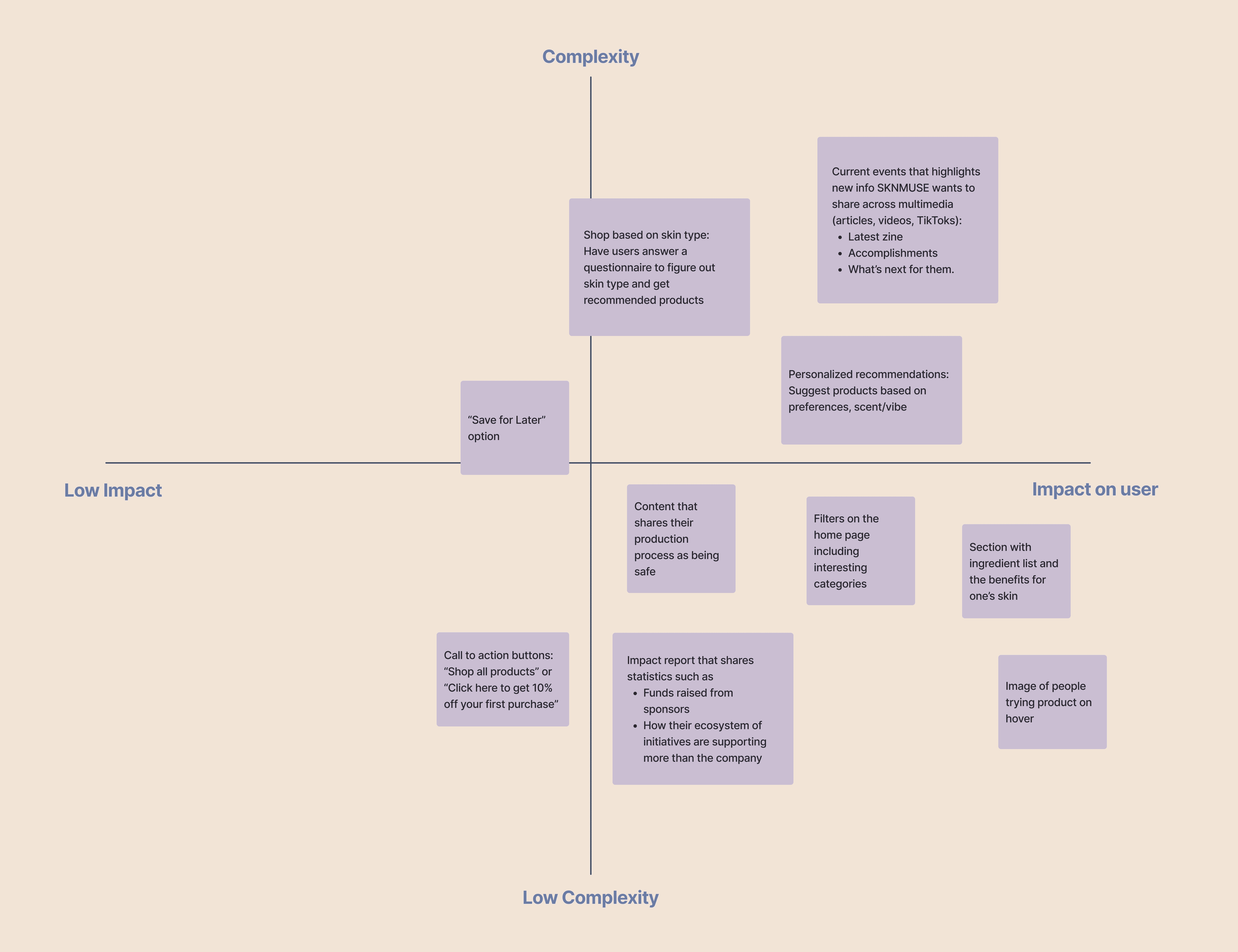
We created HMW questions based on clarifying the product offering, and driving engagement and digital connection. We translated those HMWs into actionable ideas by brainstorming features, and creating a Feature Prioritization Matrix that balances both user and stakeholder needs.
After grouping the ideas by impact and complexity, the following features were the most feasible. The features with asterisks are implementations I spearheaded from top to bottom: current events relevant to the brand(*), ingredients list and benefits, image hover, restructuring the "Homepage" and "About Us" layouts, and a new navigation menu(*).
Sketches & Low-fis
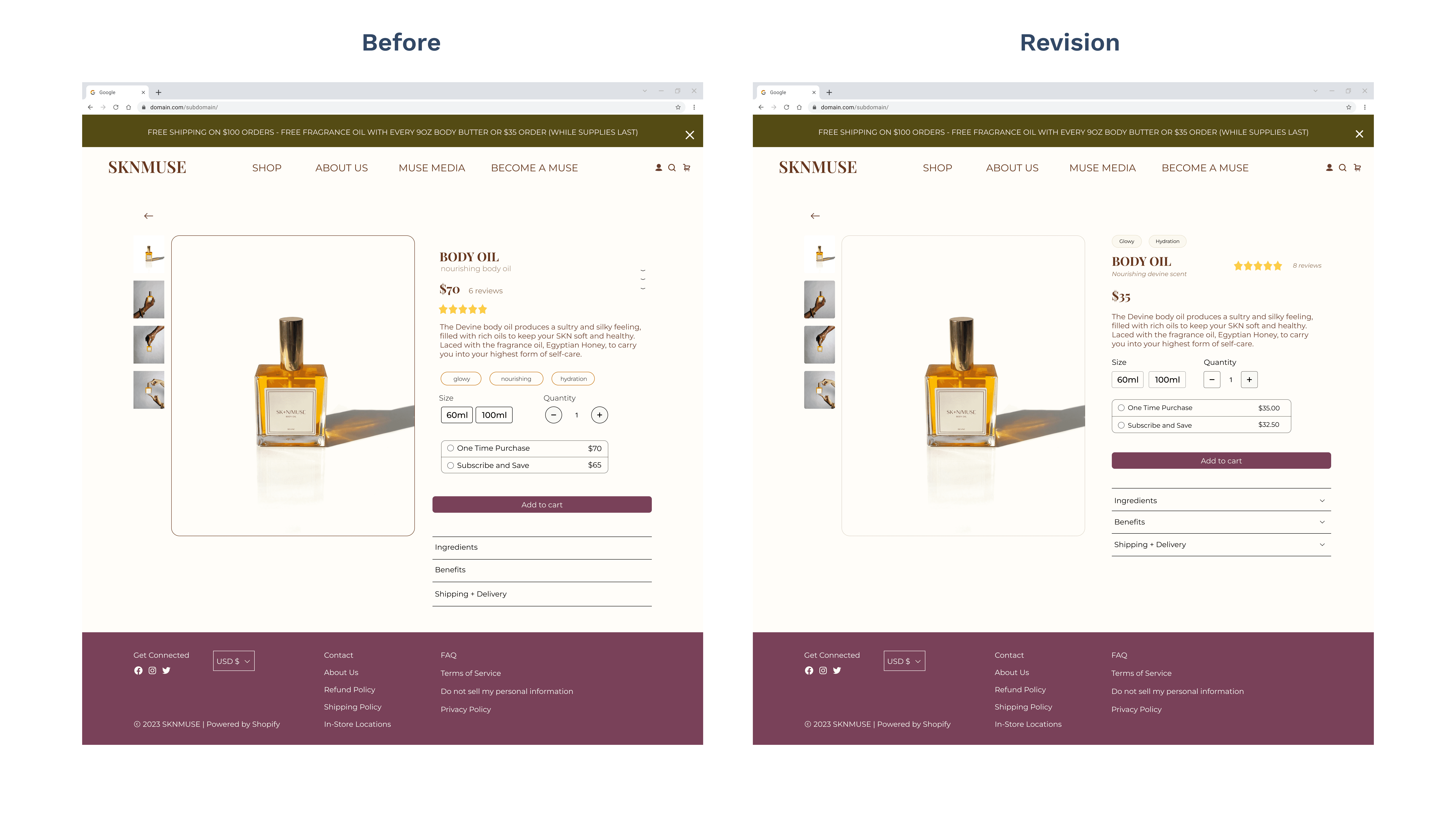
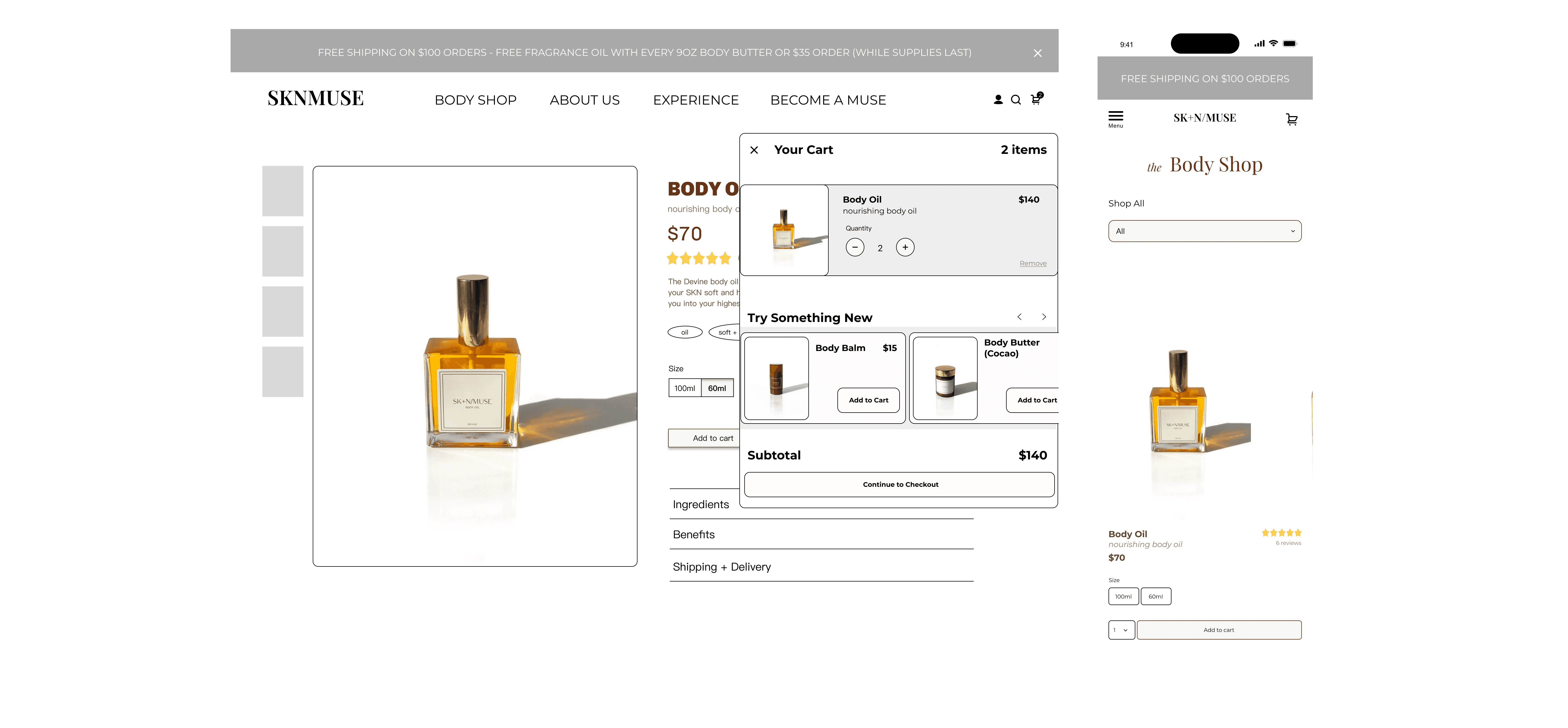
Product Detail Page: Ingredients & Benefits
To include space to educate and build transparency, we added an accordion to hide and expand product information. We also redesigned their cart modal for a smoother shopping experience.
Community-Focus: Muse Media
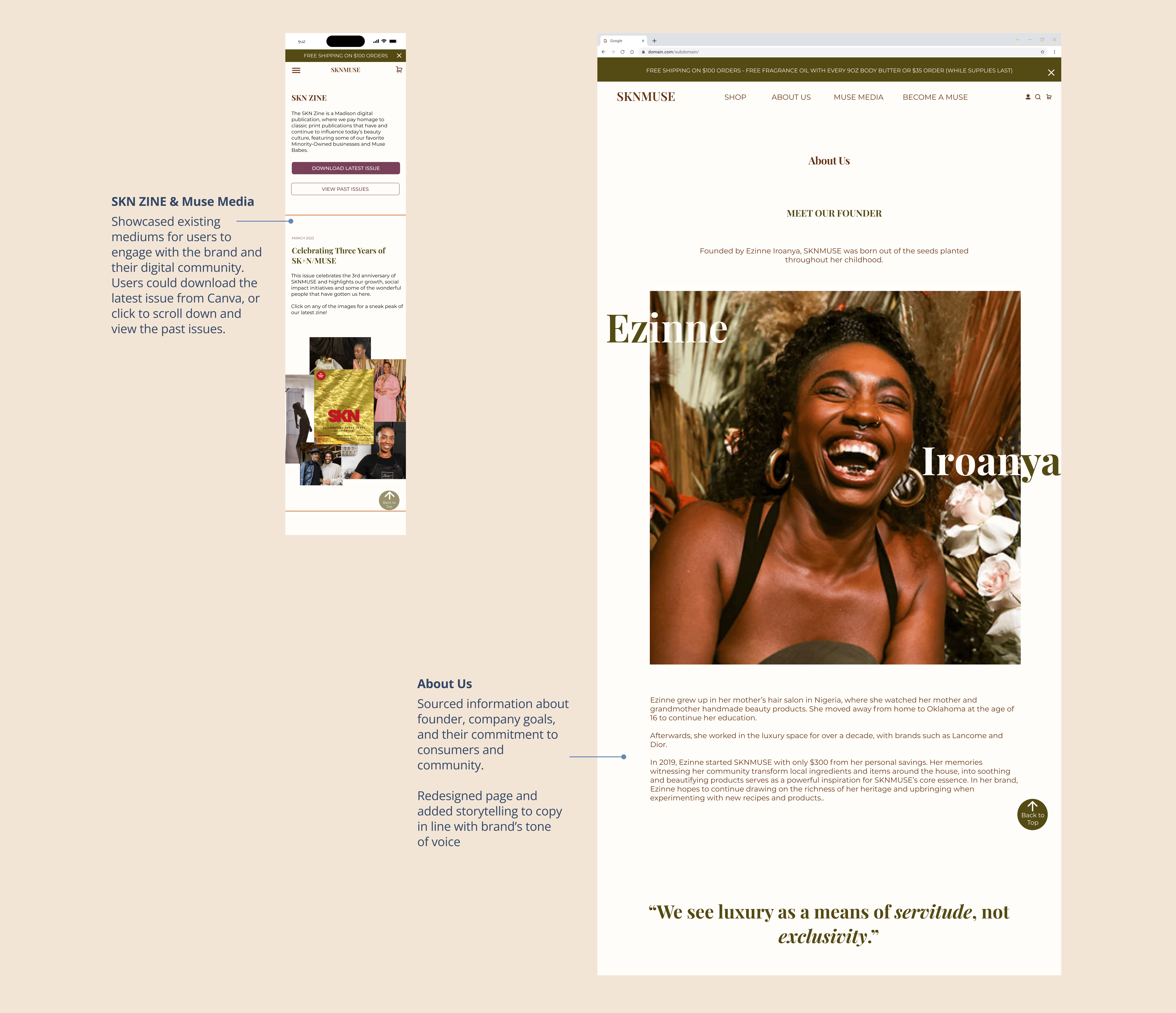
Creating a section dedicated to spotlighting SKNMUSE’s current events would help propel their growth and create an engaged customer based. Muse Media would showcase their community-related content such as their accomplishments, initiatives, and latest zine issues and playlist.
I conceptualized this feature from start to finish by creating a dedicated hub, Muse Media, to replace their “Experience” within their website's current architecture.
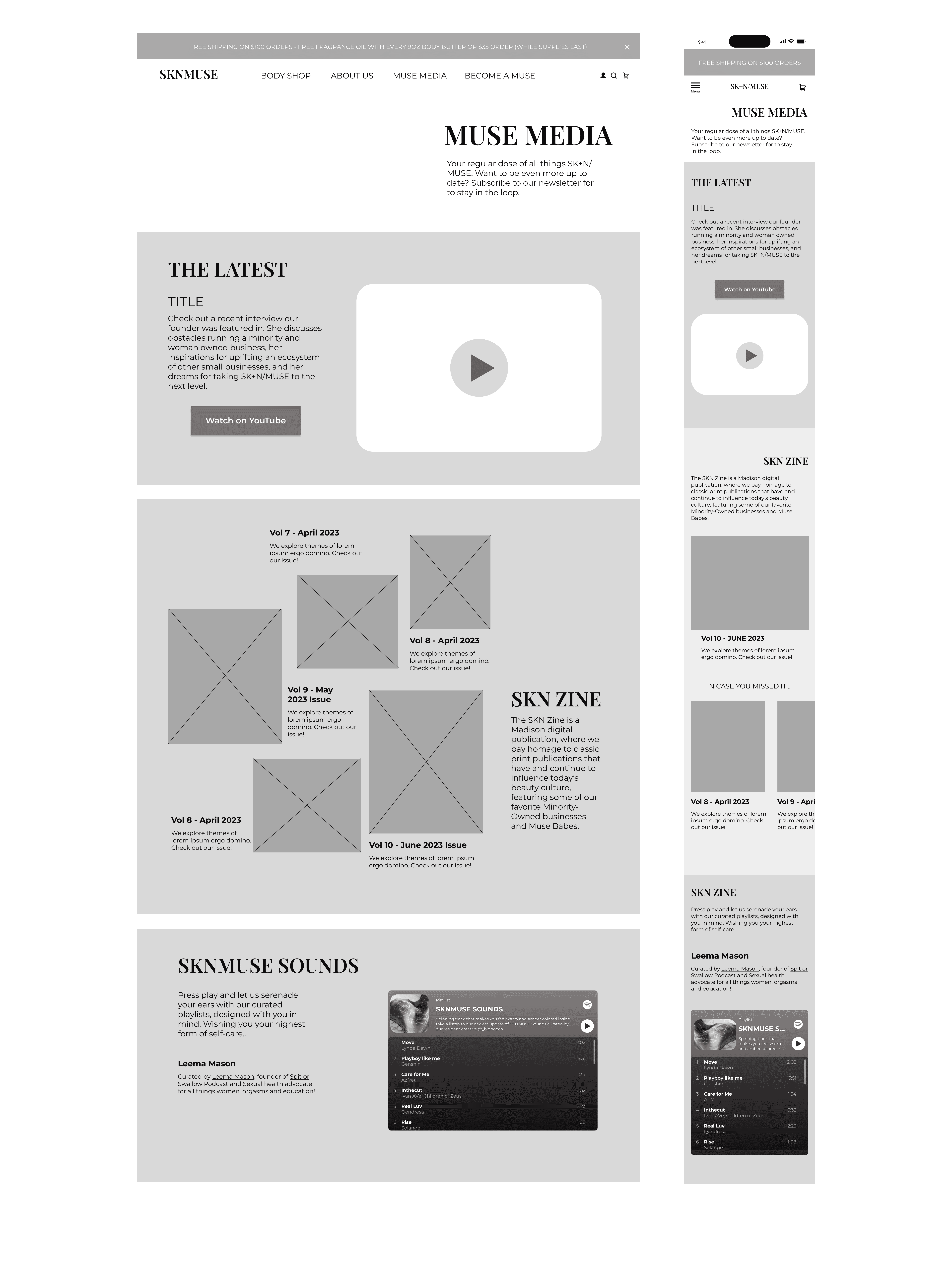
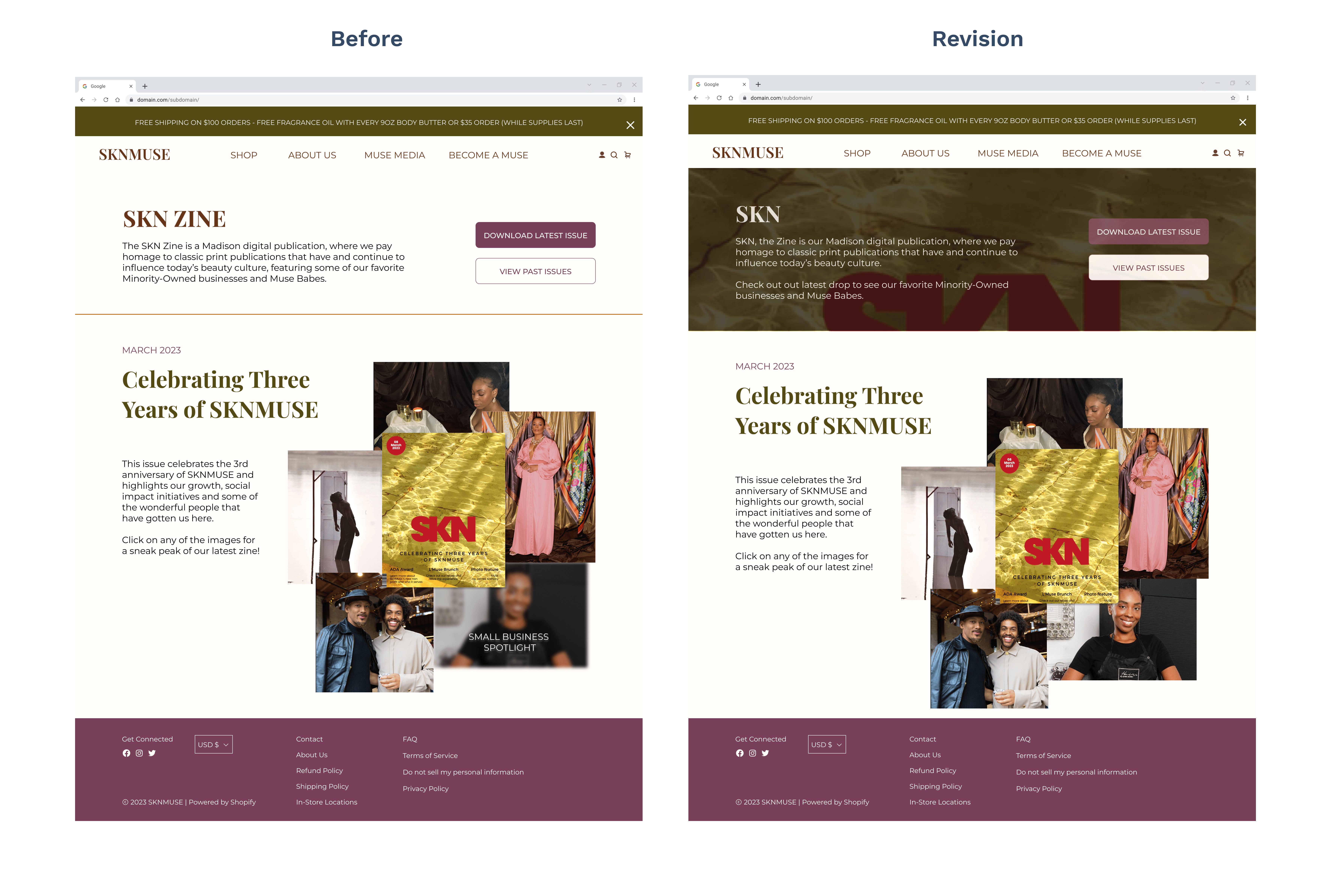
Muse Media: SKN ZINE
The brand created quarterly zines that were embedded as a Canva link to their website, which required users to flip through 25+ pages to get through the content. I wanted to transform this section so users could skim through this page to better grasp topics within the publication.
I created two versions of SKN ZINE. One spotlighted past issues at the top and allowed users to scroll down. The other included a button for users to download the latest issue, incorporated hoverable images that once clicked, would scrolled users to that content’s section, and shared past issues at the bottom.
Restructuring Homepage & About Us
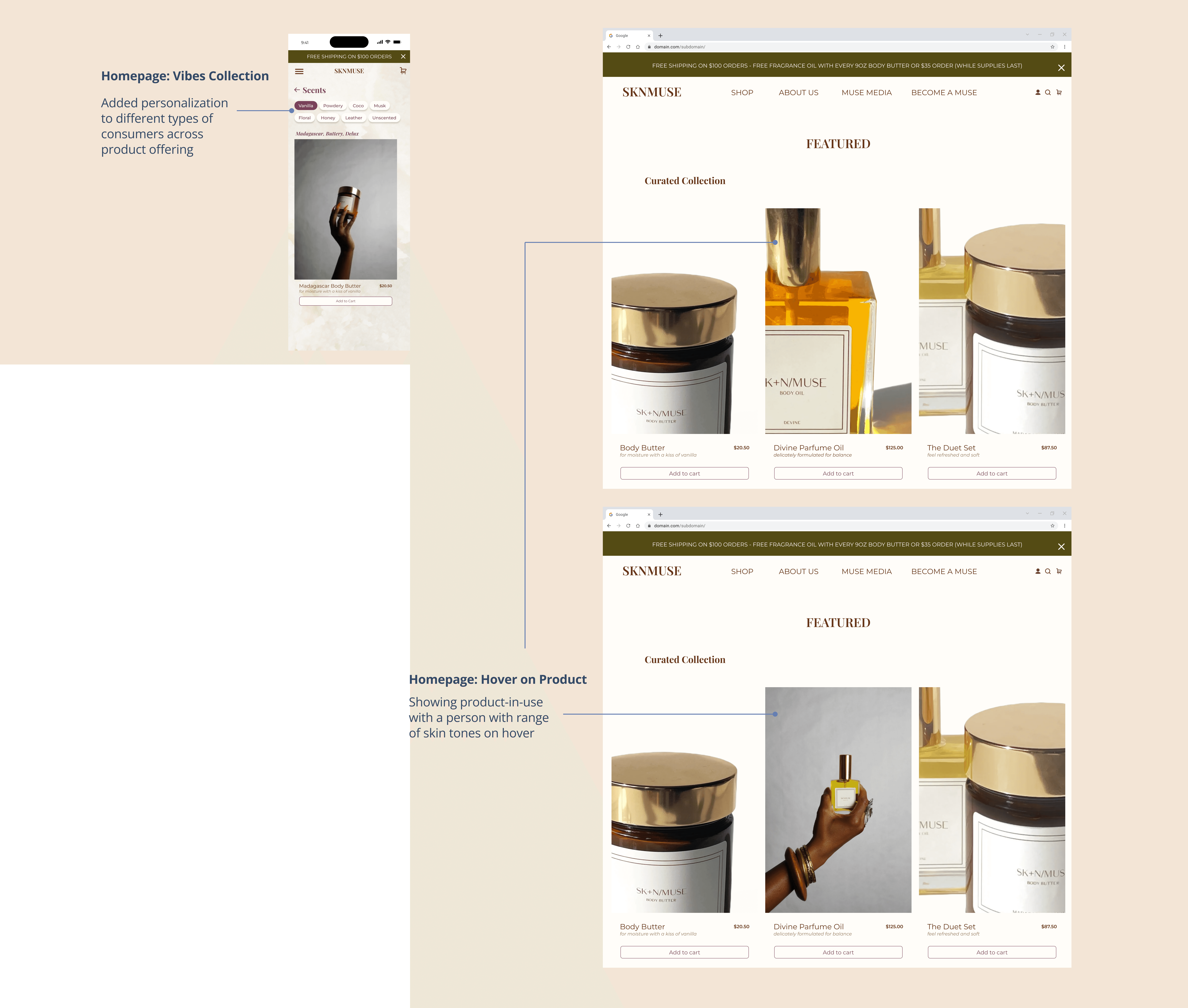
On the Homepage, we added a CTA to shop products, carousal showcasing products, a clickable “Pick Your Glow” grid to highlight the product range, and a “Vibes” section for curated collections for different types of users.
The About Us page would capture the brand’s uniqueness by spotlighting the founder and company’s story, and include content about their West-African inspiration, values, production process, and community involvement.
Prototype findings
We conducted 5 user tests across our low-fidelity desktop and mobile prototypes, focusing on assessing the time on task, task completion, and drop off rates from users.
Hi-fi prototypes & learnings
Moving into hi-fis, we rewrote copy on their website to have their voice be grounded, conversational, comforting, and to resemble a relationship that one would have with their “Aunty”.
Visually, we incorporated deep, rich tones to create a high-touchpoint look and feel, along with an orange accent found in the undertone of the brand’s existing assets products.
What was the impact?
Results & Revisions
We presented our redesign to SKNMUSE, and the CEO and CCO responded enthusiastically to our approach. Below is feedback we received that we would have progressed on further if the project scope and timeline had allowed.
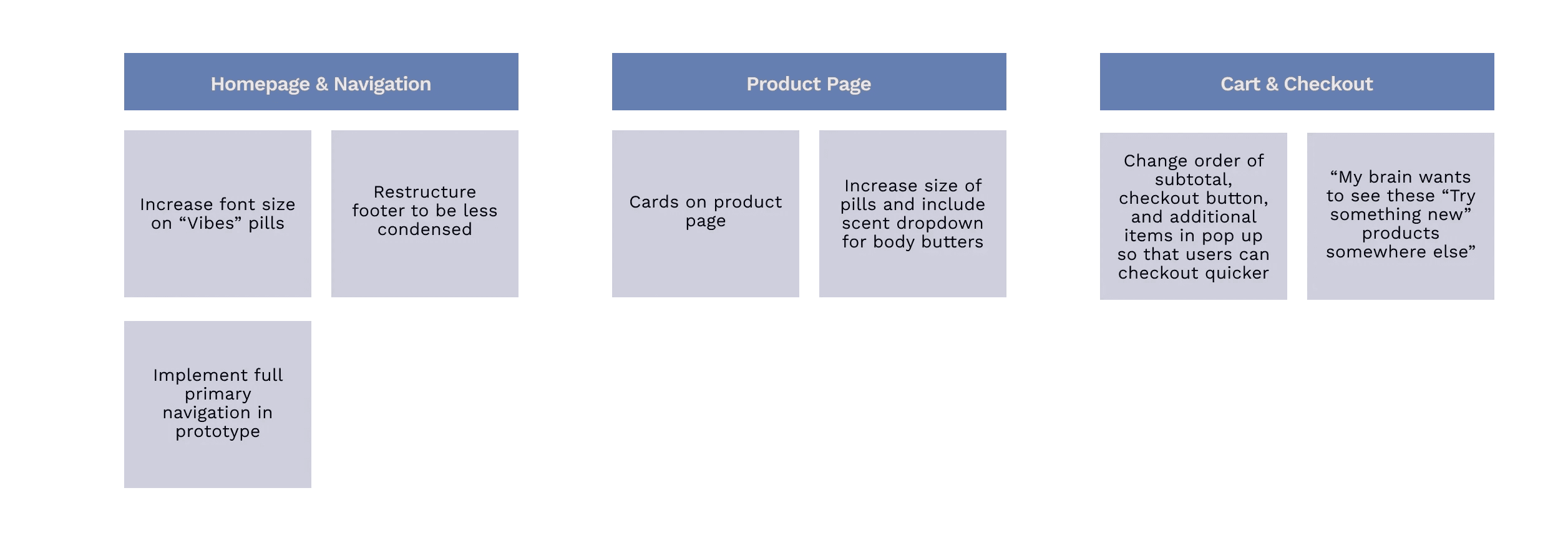
In addition, I directly revised several key flows, including the product detail pages and the “About Us” layout and copy, to better communicate a cohesive and timeless brand message. I also refined the “Skn the Zine” page to strengthen its visual identity and ensure consistency across the website.